Data is only useful if people actually understand it. In 2026, the best dashboard templates do more than look pretty — they make insights obvious, decisions faster, and reports easier to produce. If you regularly prepare weekly reports, client dashboards, or executive summaries, the right PowerPoint template saves hours and helps you look sharp.
Below are top dashboard & report templates (hand-picked for clarity, visuals, and real-world use). Each one is ready to plug into your workflow — just drop your numbers, swap colors, and present.
Why use a dashboard template?
- Speed: Build reports in minutes, not hours.
- Consistency: Same layout, same language across reports.
- Clarity: Visuals that make trends and gaps obvious.
- Professionalism: Investor- and client-ready slides out of the box.
Top Dashboard Report Templates for 2026
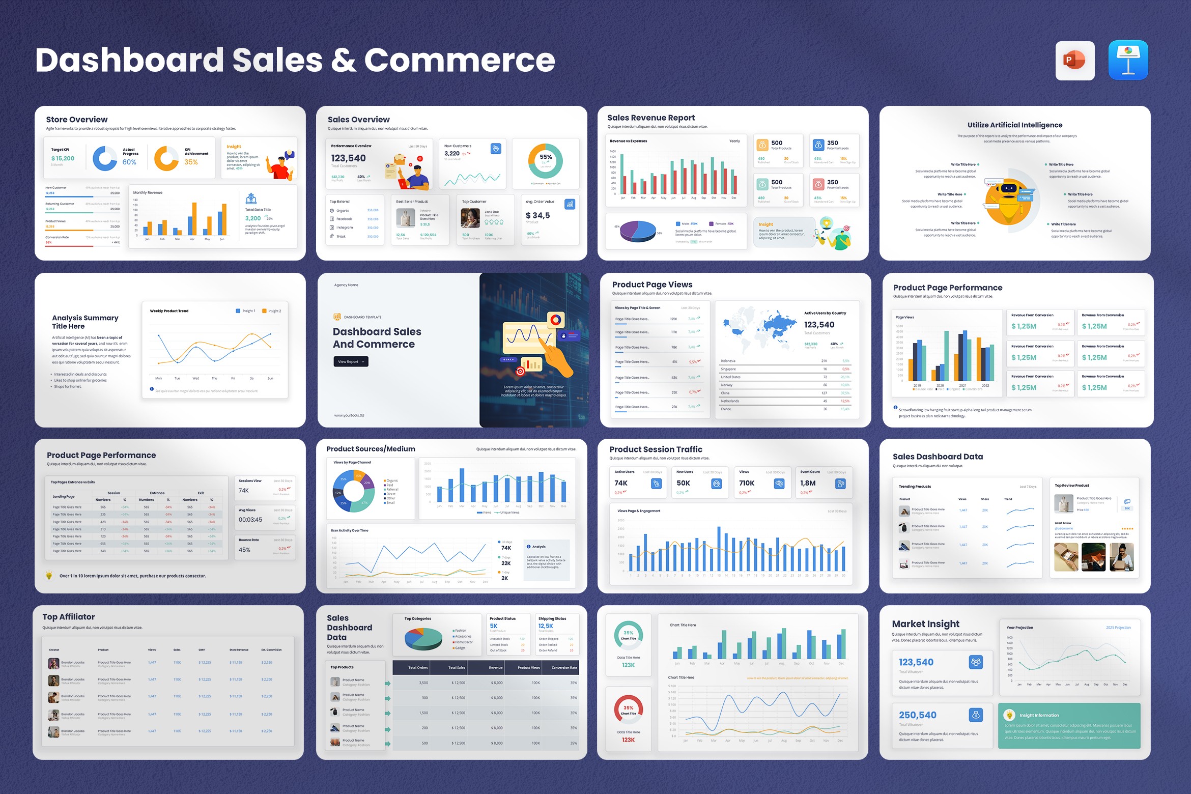
Dashboard Sales & Commerce Presentation Template
Best for: E-commerce and sales performance reviews.
Packed with conversion funnels, sales-by-channel breakdowns, product-level KPIs, and clean tables — this template helps you show revenue drivers and conversion leaks clearly.
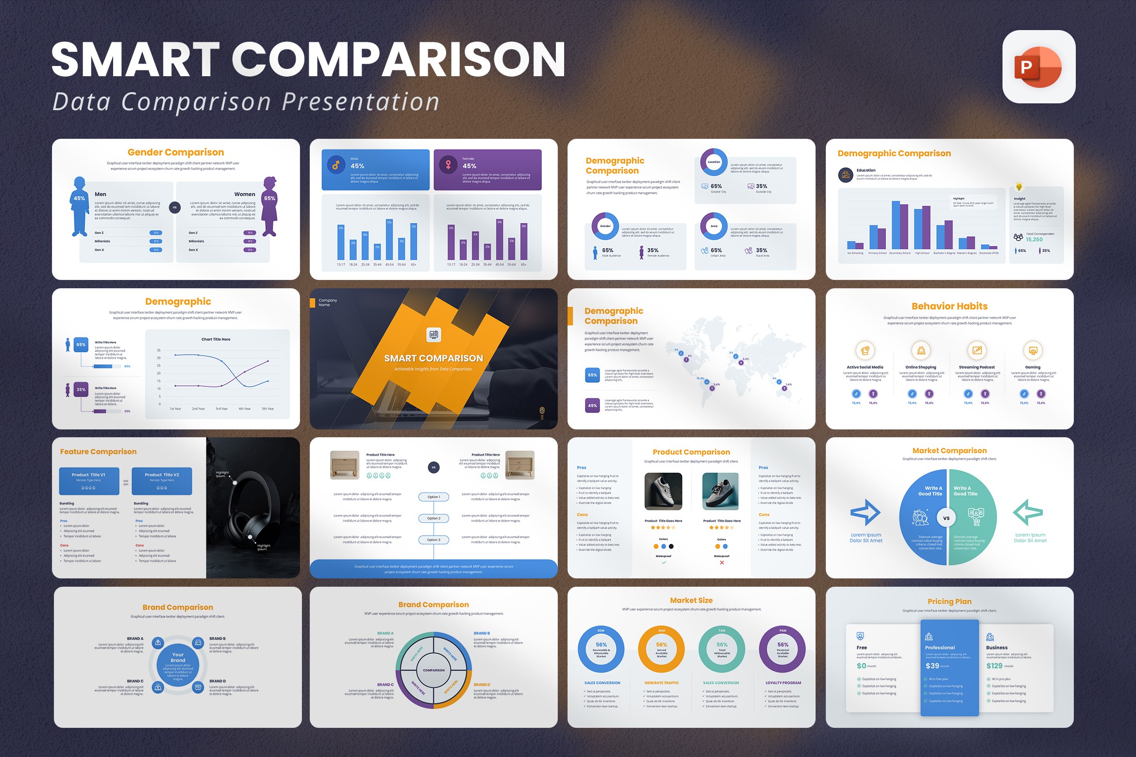
Smart Comparison – Data Comparison PowerPoint Template
Best for: Executive summaries and side-by-side comparisons.
When you need to compare periods, campaigns, or A/B test results, this template’s comparison visuals and clean tables make differences obvious at a glance.
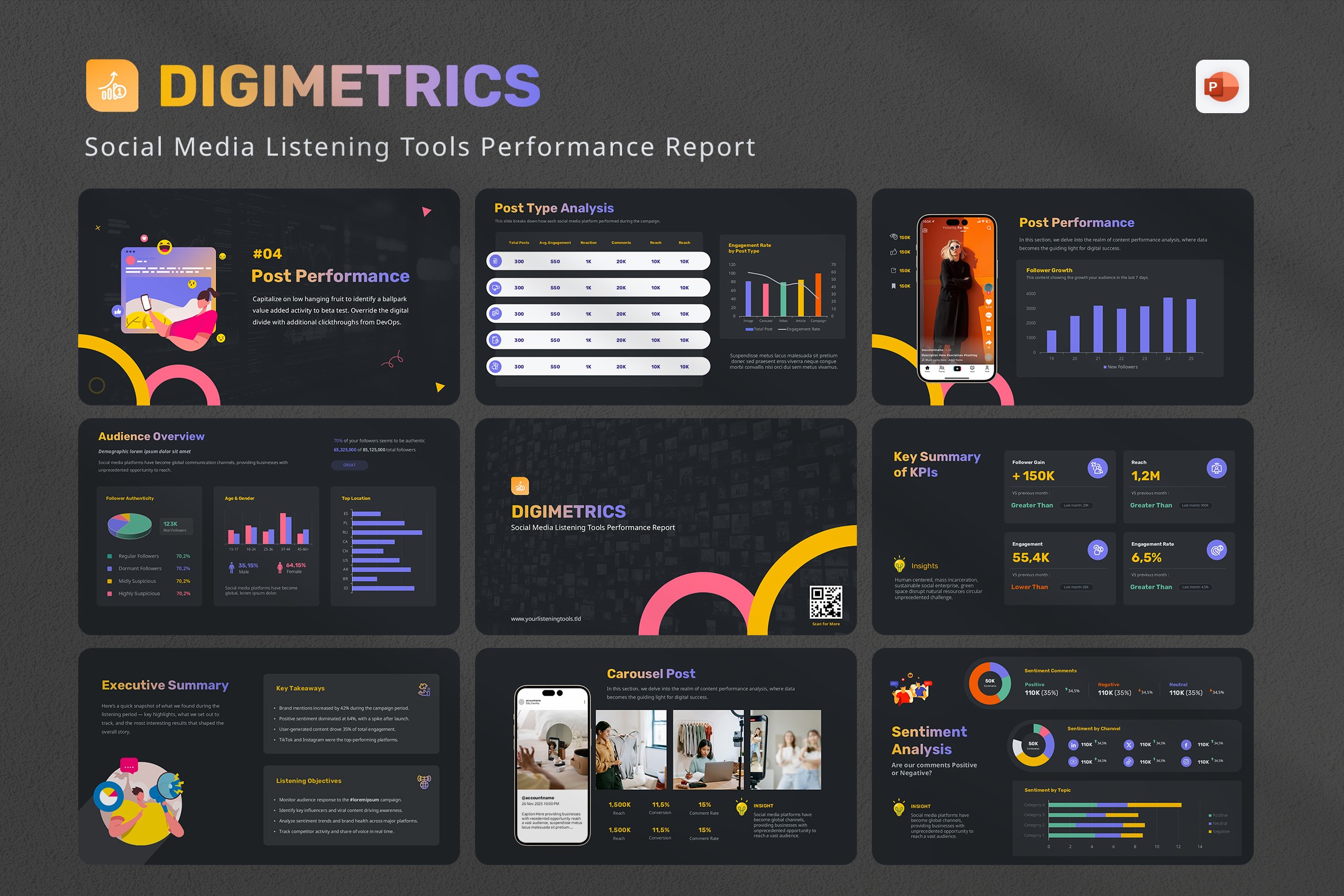
DigiMetrics – Social Media Listening & Performance Report
Best for: Social listening and campaign analysis.
Use this for brand health reports, sentiment highlights, top mentions, and campaign impact. The layouts are built for narrative + data — great for monthly client reports.
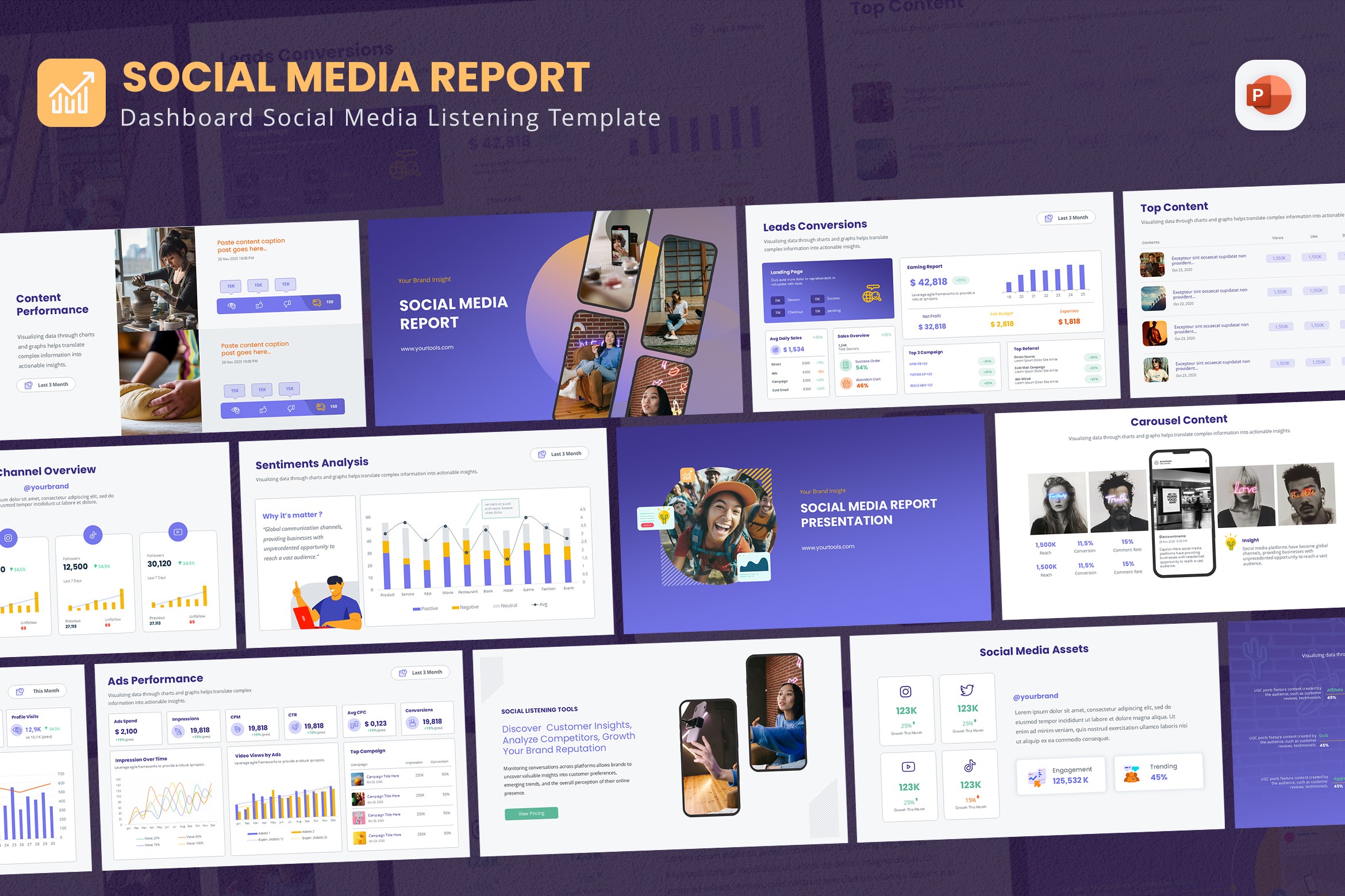
New Social Media Dashboard PowerPoint Template
Best for: Channel-level dashboards (Instagram, TikTok, Facebook, YouTube).
Includes KPI cards, trend charts, and audience demographics — perfect when you need a focused social performance snapshot.
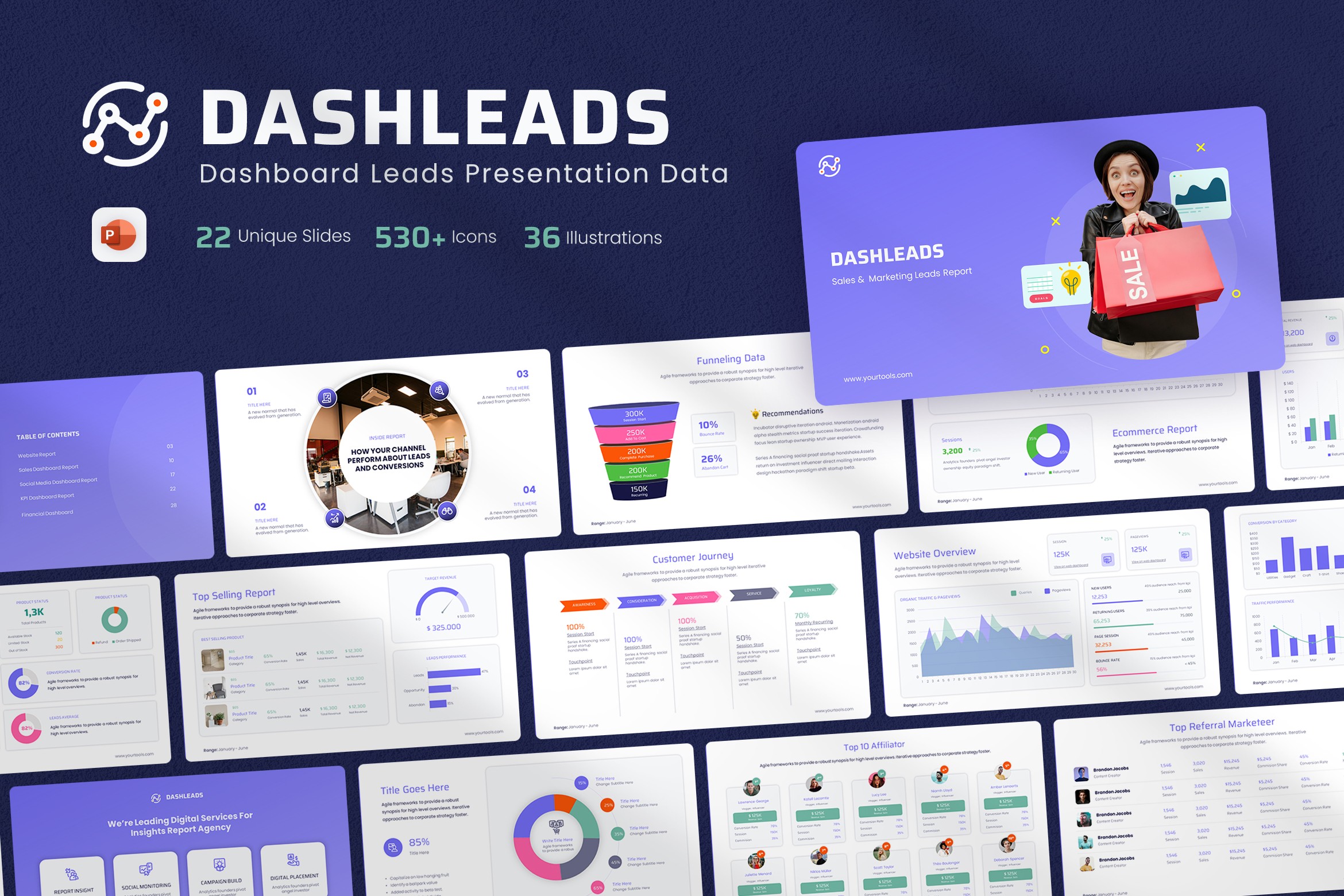
DashLeads – Dashboard & E-commerce Leads Template
Best for: Lead-gen performance and ecommerce acquisition reports.
Use this for CPL, LTV estimates, acquisition channel comparisons, and to show which campaigns are actually moving revenue.
Brandalytics – TikTok Analytics Report Template
Best for: TikTok campaign reporting and creator partnerships.
Analytics layouts focused on video performance, reach vs. engagement, and creative-level breakdowns — handy for social-first brands and agencies.
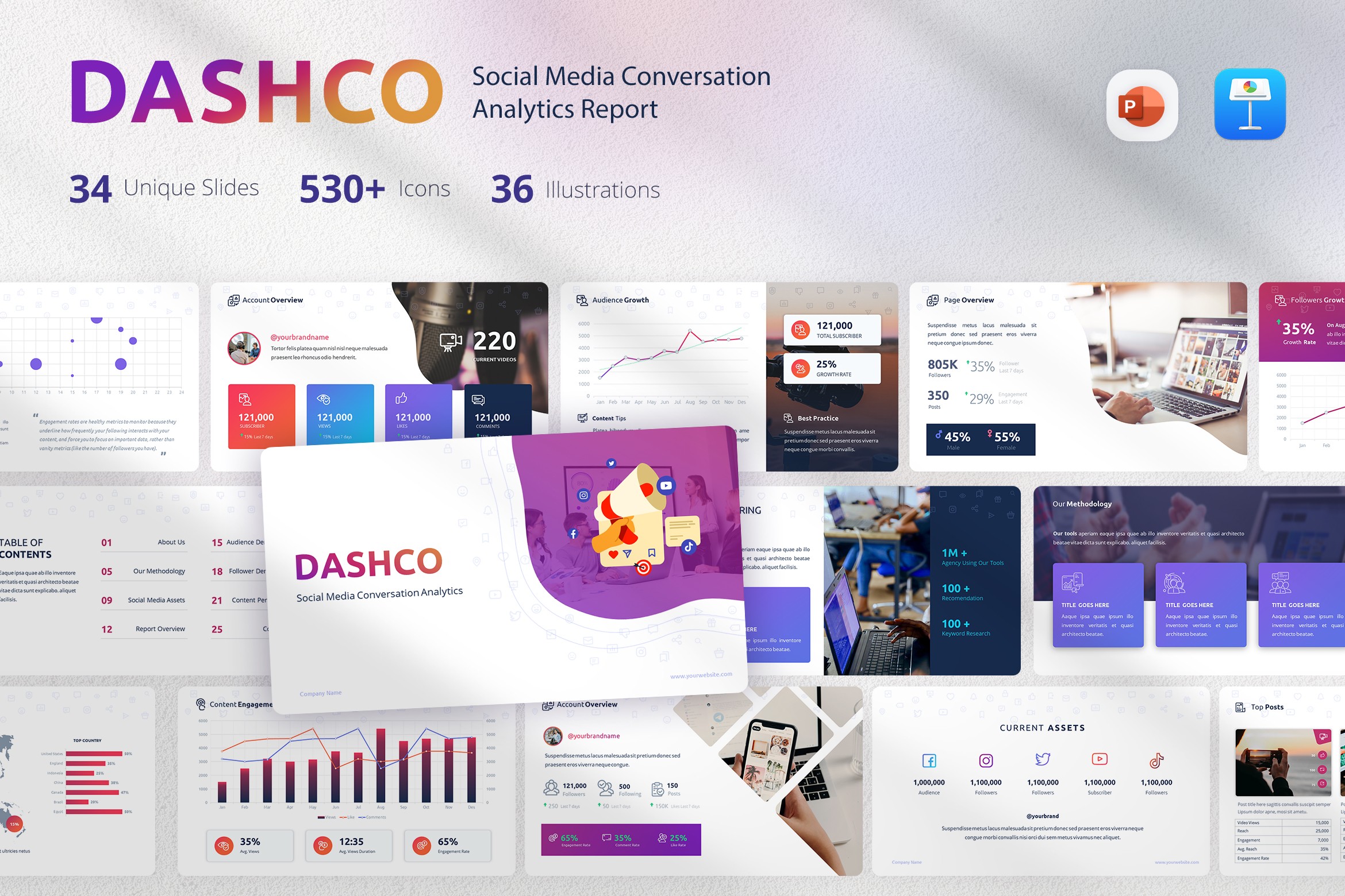
DashCo – Social Media Report & Analytics
Best for: Cross-channel social + website dashboards.
A hybrid template that merges social metrics and site analytics into one clean deck — useful for cross-functional updates and monthly business reviews.
How to pick the right template
- For revenue-focused updates: use Sales & Commerce or DashLeads.
- For social-first reporting: pick DigiMetrics, New Social Media Dashboard, or Brandalytics.
- For executive summaries or board reports: Smart Comparison is ideal — it highlights differences and priorities fast.
- For conversion analysis: FNNL funnel visuals make drop-offs and opportunities clear.
Quick tips to make your dashboard reports better
- Keep one insight per slide: Tell a story — start with the headline insight, then show supporting metrics.
- Use consistent time frames: Compare month-to-month or quarter-to-quarter, not mixed periods.
- Highlight actions: Always end with recommended next steps or optimizations.
- Use brand colors sparingly: Color for emphasis, not decoration.
- Export a PDF for clients: Keeps layout and fonts intact across devices.
Final thought
Great templates don’t replace your insight — they make it visible. With the right dashboard template, presenting data becomes faster, clearer, and more actionable. Pick the template that matches your report’s goal, and let the visuals do the heavy lifting.
Need more templates or a custom set? Check the links above and pick the design that fits your workflow — then copy, paste, and present.
Resources & sample checklist: 10 Proven Tips to Reduce PowerPoint File Size