Venn diagrams are a simple but powerful way to show relationships, overlaps, and comparisons between ideas. Whether you’re preparing a pitch deck, a school project, or a business presentation, a Venn diagram can help simplify complex information into a visual your audience will instantly understand.
The good news? You don’t need special design software. PowerPoint already has built-in tools to create Venn diagrams in just a few clicks. Here’s how you can do it step by step.
📝 Step 1: Insert a SmartArt Graphic
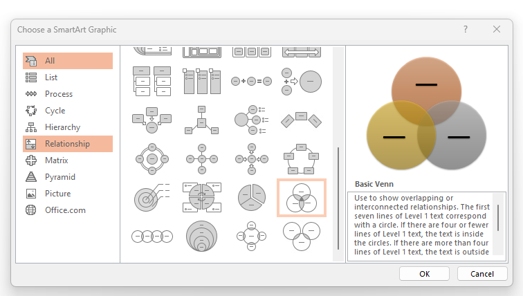
- Open your PowerPoint slide where you want to place the diagram.
- Go to the Insert tab on the top menu.
- Click SmartArt → Choose Relationship from the left menu.
- Select Basic Venn and hit OK.
Step 2: Add and Edit Circles
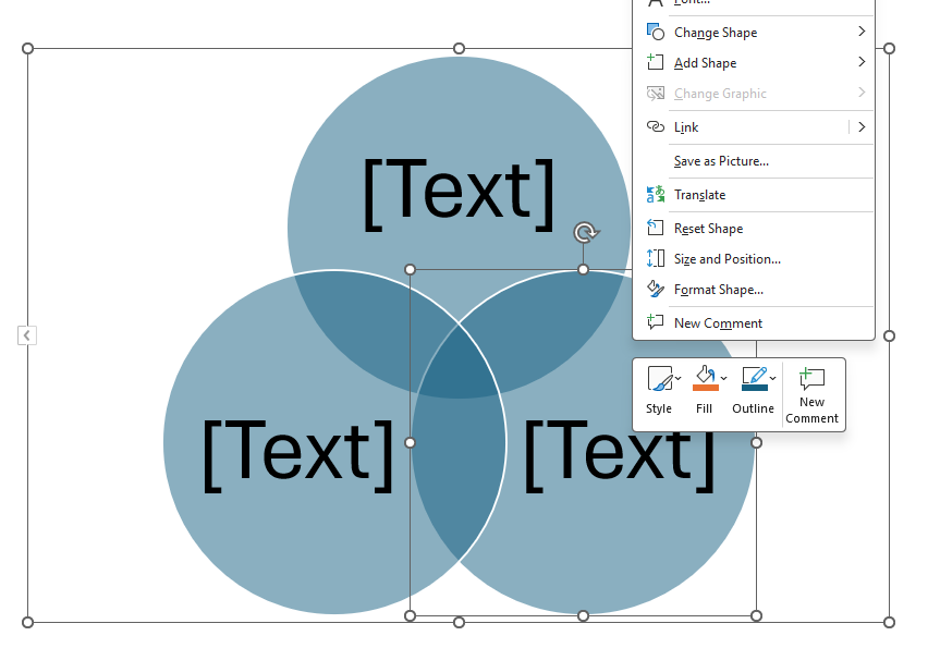
By default, you’ll get three overlapping circles. You can:
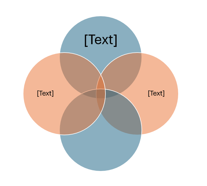
- Add more circles: Right-click → Add Shape.
- Resize circles: Drag the edges to make them bigger or smaller.
- Reposition: Move them around to get the right overlap.
Step 3: Add Text
Click inside each circle to type text directly. You can also use the SmartArt Text Pane to type your content — it will auto-update inside the diagram.
Step 4: Customize Design
Make your Venn diagram look polished with a few quick tweaks:
- Change colors: Go to SmartArt Design → Change Colors.
- Use transparency: Adjust circle fill transparency so overlaps are more visible.
- Add icons or numbers: Insert simple icons or data points inside each circle.
- Use brand colors: Apply your company or project’s color scheme for consistency.
Pro Tips for Venn Diagrams
- Stick to 2–4 circles. Too many will make it cluttered.
- Use high-contrast text for readability.
- Animate overlaps if you want to reveal relationships step by step.
- Pair your Venn diagram with concise bullet points to add context.
Final Thoughts
Creating a Venn diagram in PowerPoint is quick and straightforward with SmartArt. With a few design tweaks — like colors, transparency, and text — you can turn a simple diagram into a professional slide that communicates clearly.
Next time you need to show comparisons or relationships, skip the spreadsheet and try a Venn diagram. Your audience will thank you.
Download Our Best Powerpoint Template fo KPI's Report
Dashboard Sales & Commerce KPI's Report Dashboard Presentation
is a modern, easy-to-edit PowerPoint solution designed to help you present sales metrics, commerce trends, and business performance with clarity. Whether you're pitching to stakeholders, reporting to executives, or sharing monthly results with your team, this template makes data-driven storytelling faster and more impactful.
➡️ Check More Templates Here