
Table of Contents
Let’s be honest — data can be boring. Numbers, percentages, charts… on their own, they don’t say much. But when you turn that data into a story, something changes. People start to care. They listen, they understand, and more importantly — they take action.
This is the heart of good reporting: not just showing data, but telling something with it.
Whether you’re creating a monthly marketing report or a pitch for a new idea, here’s how to turn raw data into a narrative that sticks.
1. Start with the “Why”
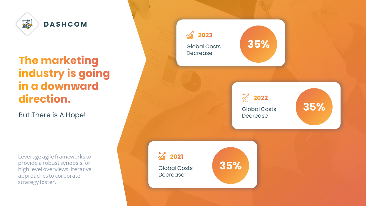
Source : Dashcom - Web, Ecommerce, Social Media Report Template
Before you even open your spreadsheet or dashboard, take a step back. Why are you making this report? What’s the one thing you want your audience to walk away with?
If you’re talking to a client, maybe they just want to know if things are working. If it’s a stakeholder, maybe they’re looking for trends and opportunities. Always frame your data around a purpose — otherwise, it’s just noise.
2. Give It a Beginning, Middle, and End
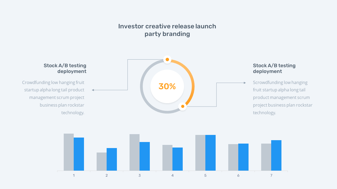
Source : SocioReport - Social Media Reporting
Data doesn’t live in a vacuum. It always reflects something happening in the real world — and real-world things always have a story arc.
- Beginning: What are we looking at? Introduce the context. “We ran a campaign last month aimed at boosting engagement.”
- Middle: What did we find? This is where your data lives. Show the numbers, compare them, and highlight interesting points.
- End: What does it mean? Offer takeaways. “Based on these results, we should double down on Instagram Reels and adjust our ad targeting.”
Simple structure. Human-friendly. No one needs a PhD to get your point.
3. Use Visuals (But Use Them Wisely)
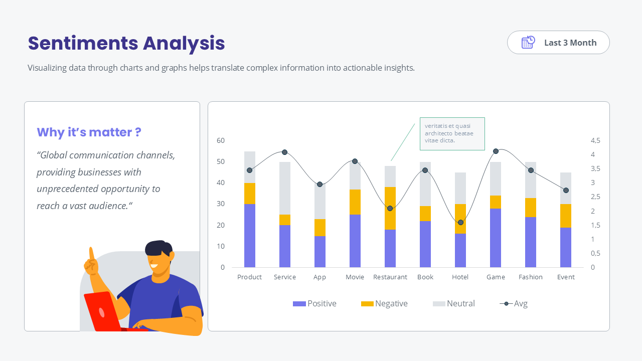
Source: New Social Media Dashboard Powerpoint Template
A well-designed chart can say in 5 seconds what 5 paragraphs can’t. So yes — use visuals. But don’t go overboard. Don’t throw 20 pie charts into one slide. Keep it clean, focused, and on-brand.
And please — avoid clutter. One powerful visual beats five confusing ones any day.
4. Speak Like a Human
Your report shouldn’t sound like a robot wrote it. Cut the corporate buzzwords and keep things conversational. You’re not dumbing it down — you’re making it clear.
Instead of saying:
“Our Q1 metrics indicate a 15% CTR uplift driven by audience segmentation refinement.”
Try:
“We saw a 15% jump in clicks after tweaking our audience targeting. Nice!”
Still professional, but way more digestible.
5. Guide, Don’t Dump
A good report is like a good tour guide. It doesn’t dump you in a museum and say “Figure it out.” It walks you through. It connects the dots. It makes you care.
Don’t just throw charts on a page — walk your reader through what each one means and why it matters. If you’re using a template (like the ones we build at Appiqa ?), think about how each section builds the narrative.
6. End With Action
Every good story has a conclusion. Your data story should too. What’s next? What should your audience do with this information?
Even if it’s just a small next step — suggest it. Guide it. That’s the difference between a report that’s read and a report that’s remembered.
Check Out : Our Best Social Media Powerpoint Template for Social Media Listening Tools
Wrap Up
You don’t need to be a novelist to tell a great story with data — you just need to care about how people receive your information. Because in the end, reporting isn’t about impressing people with how much data you have — it’s about making it make sense.
Make it clear. Make it human. Make it matter.